Service Manager
About Analytic Metrics
•Using the Drag and Drop Interface
•Working with Historical Metrics
•About Analytic Metrics Dashboards and Charts
•Adding Analytic Metrics to New Roles
•Example: Creating a Multiple Series Chart Using Multiple Business Objects
About Analytic Metrics
You can track and visualize Ivanti Service Manager information, such as cost, value, and consumption. With analytic metrics, you can see your data graphically, and chart both current data and trends. The analytic charts are flexible and customizable, and can be modified as necessary.
Some of the advantages of this tool are:
•Analytic dashboards can be viewed from Smart devices with a supported browser.
•You can save and download chart images for email or other media.
The analytic data uses dashboards to give you realtime transaction information, driven by operational activities from various service management workspaces. The Analytic Metrics workspace provides threshold-based and trend information, from which you can retrieve selected data.
Analytics consists of the following:
•Visualization component: Ten chart types are supported. See Chart Types. You can configure visual cues to let you know when key performance indicators are exceeded.
•Data source management: Access to all service management objects and saved searches.
•Analytic metric definition: Specific data can be selected, grouped, and updated. See Defining the Metric Settings.
To allow roles other than the administrator to create and publish analytic metric dashboards and dashboard parts, see Adding Layouts to a Role.
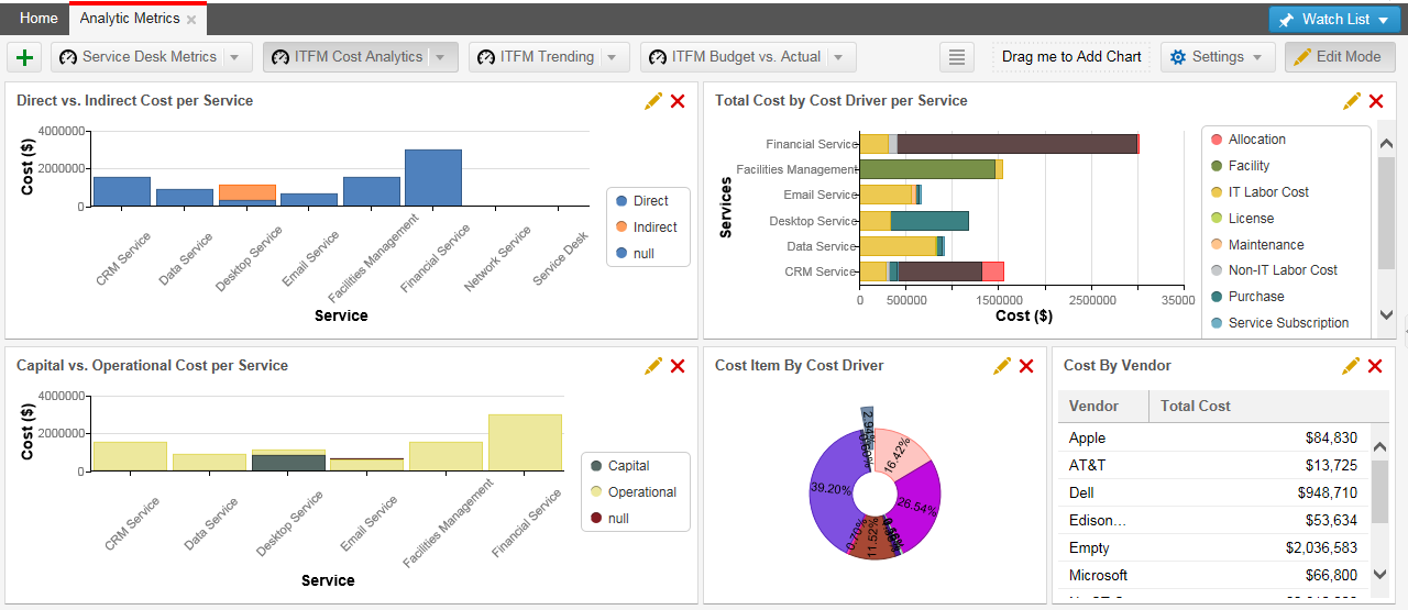
Viewing Analytic Metrics
Various useful analytic charts and dashboards are included with Ivanti Service Manager.
1.Log into the Service Desk.
2.Open the Analytic Metrics workspace.
The following dashboard tabs appear by default:
•Service Desk Metrics (appears for new and existing customers)
•ITFM Cost Analytics (appears for new customers only)
•ITFM Trending (appears for new customers only)
•ITFM Budget vs. Actual
•Business Value Metrics (appears for new customers only)
•Service Consumption Analytics (appears for new customers only)
•Availability
You can modify or delete each dashboard, or add a new dashboard based on an existing one.
3.Hover over a graph to show the view icons.
Analytic Metrics
•Information  : Shows when the data (or chart) was updated, how long it took, and when the next update happens.
•Maximize  : Expand the graph to full screen.
•Save as Image  : Click to capture a snapshot of the graph on your local machine.
4.Hover your mouse over graph items to see the data.
5.Click Menu  in the tab area to access hidden dashboards.
Using the Drag and Drop Interface
You can modify the analytic dashboards by dragging the charts to other parts of the dashboard.
1.Log into the Service Desk.
2.Open the Analytic Metrics workspace.
3.Click Edit Mode in the top right corner.
4.Drag a chart from one area to another.
5.Hover over a chart until the move  icon appears.
6.Drag the chart to an area and drop it. The dashboard automatically resizes to accommodate your changes.
About Data View
Multiple Data Sources: You can compare data from multiple sources, or data from a single source using different saved searches, using the split series function definition. See Adding or Editing a Data Source.
Data Values: You can view the data values for each chart element.
•Hover your mouse over the chart (such as a bar or pie section) to see the pop-up data value.
•The values that users can see is totally customizable. See Chart Types.
Drill Down Data: You can easily view drill down data.
•Users can click a data point on a chart and open the corresponding business object.
•Administrators can customize different levels of drill down. See Chart Types.
Real-time Filtered Data: You can easily filter data to make your view clearer.
•Click items from the legend to temporarily hide them from view. Click again to show them.
Defining the Metric Settings
You can define the data set, which roles have access privileges, how often the data is updated, and determine which Analytic Metrics dashboards can be published from the Settings menu from the Analytics Metrics toolbar. After you create the metric, you can add it to the dashboard by following the steps in About Analytic Metrics Dashboards and Charts and Creating a Dashboard.
1.Log into the Service Desk.
2.Open the Analytic Metrics workspace.
3.Click Edit Mode in the top right corner, to go into edit mode.
4.From the Settings menu, click Manage Metrics. The Manage Metrics workspace appears.
Manage Metrics Workspace
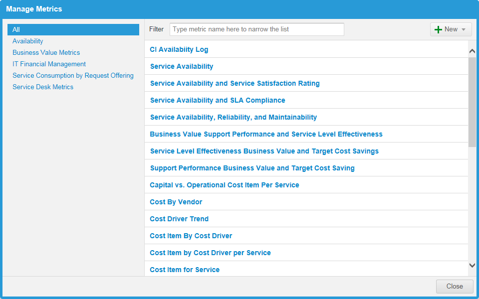
The left pane lists the data categories, and the right pane lists the metric definitions for each category.
Charts preceded by the history icon  indicate historical metrics.
Creating a Metric
The application updates the Analytic Metrics dashboards every 60 minutes. You cannot configure this time.
1.Log into the Service Desk.
2.Open the Analytic Metrics workspace.
3.Click Edit Mode in the top right corner, to go into edit mode.
4.From the Settings menu, click Manage Metrics. The Manage Metrics workspace appears.
5.Click New.
6.Select from:
•Create Metric to create a measurement.
•Historical Metric to track historical data such as total down time for a selected period.
7.Enter information into the fields:
| Field | Description |
|---|---|
| Category | The category. Choose a category from the drop-down list, or enter a name to create a new category. |
| Name | A definition. This name appears in the definition list. |
| Description | Optional. A description of the metric. |
8.Add additional information as described on the following tabs:
•Data Source: See Adding or Editing a Data Source.
•Analytic Snapshot: See Configuring Analytic Snapshot Information.
•Action Triggers: See Creating an Action Trigger.
•Access Rights: See About the Access Rights Tab.
•Object Mapping: See About Object Mapping.
9.To test, at the bottom of the window, choose the chart type then click Run. The application runs the metric and opens the Chart Preview window. The execution time appears in the window title bar. Close the window to continue.
10.Click Save. The definition appears in the list in alphabetical order.
Adding or Editing a Data Source
1.Perform steps 1-7 in Creating a Metric.
2.Do one of the following:
•To edit a data source, click the Data Source tab and make the changes needed. See Service Availability Metrics: Data Source Tab for more information.
•To add a data source click the Data Source tab, then click Add Data Source.
3.Choose either Business Object or Service Availability:
•Business Object allows you to select from any of the business objects available.
•Service Availability allows you to pick from a list of predefined saved searches for configuration items that affect availability. You can also define your own saved search from the Event workspace and have it appear in this list.
4.If you selected Business Object, enter information into the fields:
| Field | Description |
|---|---|
| Name | The name for the data source. This appears in the tab. |
| Business Object | The business object. Select from the drop-down list. |
| Saved Search | The saved search. Select from the drop-down list. This dynamic list depends on which business object is selected. |
| Group By |
Shows the data in groups. Choose a group from the drop-down list, then choose the criteria from the Pick Items link.
NOTE: The application only shows the first 500 items in the pick list. |
| 2nd Level Group By |
Shows a second level to group the data, to show in charts. Choose a group from the drop-down list, then choose the criteria from the Pick Items link. See Chart Types.
NOTE: The application only shows the first 500 items in the pick list. |
| Split in Series By | Enables you to split the data within a chart. To split a series, choose a field from the drop-down list, then choose the criteria from the Pick Items link. The data is then split on each chart. See About Analytic Metrics Dashboards and Charts. |
| Statistic Field | The fields from which your statistics are derived. You can have up to four fields. |
| Label | A label for the data. |
| Using | The field to use. Select from the drop-down list. This dynamic list depends on which business object is selected. |
| With | The calculation value. Select from the drop-down list. This dynamic list depends on the Using field selected. You can select from Count, Percent distribution, or Percent distribution per row. |
| Order by |
The sort order. Choose: Do not Sort Group By Label Priority Then choose to view in ascending or descending sort order. |
| Return up to xx items | The maximum number of items to show. |
| Hide Null or 0 values | If selected, hides data with zero or no values. |
Service Availability Metrics: Data Source Tab
Enter information into the fields:
| Field | Description |
|---|---|
| Name | The name for the data source. This appears in the tab. |
| CIs | The saved search. Select from the drop-down list. If you defined a search, for example for Events, it can be selected here. |
| Events | The type of outage events. Select from the drop-down list. You can also create a custom event from the Event workspace and see it in this list. |
| Calculate | All available calculations are selected by default. |
| Reliability | Calculation based on the total up time. |
| Actual Availability (%) | Assigns a percentage to the total amount of time the device or service was operational. |
| Total Down Time |
Calculates the total amount of time (in minutes) that the device or service was non-operational. For an outage spanning a specified aggregation period, the application displays the total outage time in the period that the event was created, started, modified or ended. This depends on how the metric and data source was configured in the 2nd Level Group By field. |
| Service Satisfaction | Average survey satisfaction rate. |
| Maintainability | The average time to fix the problem. |
| 2nd Level Group By | Allows you to group the data in a chart using a second level. Select from the drop-down list, then choose the format. This setting affects the display of the outage calculation. |
| Split in Series By | Optional. Choose an object from the drop-down list. |
| Target Availability (%) | Calculates the percentage of actual availability against the target availability set for the device or the service. |
| SLA Compliance (%) | Calculates the percentage (based on the SLA Availability setting) that the service or device was available. |
| AST (Agreed Service Time) | Compares whether or not the device or service met the agreed service time requirements. |
| Statistic Fields | One field minimum. Click the add icon  to add a field. to add a field. |
| Field Name | Your choice of name |
| Using | Choose a data type: Group Records, ClosedDuration, Cost, Cost per Minute, Incident ID, ResolvedByIncidentNumber, or Total Time Spent. |
| With | Choose a calculation: Count, Average Value, Minimum Value, Maximum Value, Total Value, Standard deviation, Standard deviation for the population, Variance, or Variance for the population. |
| Order by |
The metric by which to sort the results. The list changes depending on the choices checked under the Calculate field.
Choose whether to view in ascending or descending sort order. |
| Return up to: xx items | The maximum number of items to show. |
| Hide Null or 0 values | If selected, hides data with zero or no values. |
5.Click Save.
6.Repeat to add more data sources.
Configuring Analytic Snapshot Information
This feature applies to Create Graphic only.
1.Perform steps 1-7 in Creating a Metric.
2.Click the Analytic Snapshot tab and configure the following information.
| Field | Description |
|---|---|
| Calculate Trend | Check to calculate trend data. |
| Calculate Historical |
Check to calculate historical data. The following fields appear. After activating this metric for historical data, enter the information in the fields listed below. Continue to Working with Historical Metrics below for more information. |
| Trend Data Collection Start Date | Enter the start date and time of the data you want to track. |
| Execute using role | Select the role that is allowed to execute the calculation from the list. |
| Minimum Historical Trend Interval | Choose the data interval from the drop-down list. |
| Use Time Zone | Set a time zone that is used to begin the calculation. For example, setting the time to 8:00 AM in Pacific Time (UTC - 08:00), begins calculations for devices or services at 11:00 PM for Eastern Time (UTC - 05:00). |
| Calculated Detail Level | Check all of the levels to calculate. |
Creating an Action Trigger
1.Perform steps 1-7 in Creating a Metric.
2.Click the Action Triggers tab.
3.Click Create New, and then configure the following information:
| Field | Description |
|---|---|
| Name | A name for the trigger. |
| Series | A name for the series. Enter a name or choose one from the drop-down list. This value is based on the chosen data source. |
| Label | Where to derive the label. Choose from the drop-down list. This value is based on the chosen data source. |
| Use | The use. Choose from the drop-down list. |
| Type | The type. Select from Single Value Threshold or Range Threshold. |
| Condition | The condition. Choose from the drop-down list. |
| Threshold | Only displayed if you select Single Value Threshold. Enter a number. |
| High boundary | Only displayed if you select Range Threshold. Enter a number. |
| Low boundary | Only displayed if you select Range Threshold. Enter a number. |
| Workflow | The workflow. Choose from the drop-down list. See Using Workflows. |
| Limit to | The number of times to perform the action with this trigger. |
4.Click Save.
About the Access Rights Tab
The Access Rights tab allows you to manage which roles have access to this metric.
Move roles from the left pane to the right pane to allow access, or you can check Allow access to All to allow access for all roles.
About Object Mapping
Set up the information in this tab to export the metric data to the associate business object. This allows you to see availability in the CI Log for selected configuration item types.
This tab may not be available for all metrics. However for items such as the configuration item availability log or other business objects, you can set the following parameters.
| Field | Description |
|---|---|
| Export Target |
Business object (default setting). |
| Business Object | Selects the business object to which the data will be exported. This should be the same as the object for which the metrics are gathered. |
| Label | Choose from the drop-down list. |
| Linked field | The default information is automatically displayed. |
| Metric ID | Select Metric ID. The default information is automatically displayed. |
| Metric Name | Select Metric Name. The default information is automatically displayed. |
| Role | Select Role. The default information is automatically displayed. |
| User ID | Select User ID. The default information is automatically displayed. |
| Values | This list is automatically created from the calculate values checked in the Data Source tab. |
Working with Historical Metrics
About Historical Metrics
A historical metric allows you to view data by any specified time period. For example, if you set up a historical metric to track how many incidents are in active status, you would get the following chart:
Historical Metric of Incident Status
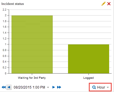
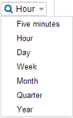
Select the time frame from the time drop-down list. In this case, hour is chosen.
Select Hour
Navigate through each hour to see the number of active incidents by using the previous and next arrows. You can also go to the first or last hour tracked.
Creating a Historical Metric
1.Activate the historical data from within the metric chart you want from the Analytic Snapshot tab. See Configuring Analytic Snapshot Information.
2.Click Edit Mode in the top right corner to go into edit mode.
3.From the Settings menu, click Manage Metrics. The Manage Metrics workspace appears.
4.Click New and choose Historical Metric.
5.On the General tab, enter the required information.
| Field | Description |
|---|---|
| Category | The category. Choose a category from the drop-down list, or enter a name to create a new category. |
| Name | A definition. This name appears in the definition list. |
| Description | Optional. A description of the metric. |
6.Click the Data Source tab and enter the required information.
| Field | Description |
|---|---|
| History from |
Choose a history from the drop-down list. This list is populated when metrics are collecting historical data. See Configuring Analytic Snapshot Information. The following fields might appear depending on the value chosen. |
| Using series | Choose from the drop-down list. |
| Show | Choose from the drop-down list. |
| Detail Level | The detail level. |
| Intervals | The number of times the application calculates the data. The default value is 1. |
| Data Point | Shows data points as a series. |
| Hide Zero Rows | Hides rows that have no data. |
7.Click the Access Rights tab and move individual roles you want to have access to this metric from the list on the left to the right. You can also check Allow access to All to automatically give all roles access to the metric data.
8.Click the Object Mapping tab and enter the required information. See About Object Mapping.
9.To test, at the bottom of the window, choose the chart type then click Run. The metric is run and the Chart Preview window opens. The execution time appears in the window title bar. Close the window to continue.
10.Click Save. The definition appears in the list in alphabetical order.
Publishing Dashboards
While you create a new dashboard, you are the only one who can view it. Follow these steps to publish your dashboard:
1.Log into the Service Desk.
2.Open the Analytic Metrics workspace.
3.Click Edit Mode in the top right corner to go into edit mode.
4.From the Settings menu, click Publish Dashboards. The Publish Dashboards window appears.
5.From the Role: menu, choose a role to which to publish your dashboards.
6.To publish a dashboard, move it from the Available Dashboards list to the Published Dashboards list. You can drag and drop the dashboard or select a dashboard and click the arrow keys.
7.To change the order of appearance, move the dashboards up or down in Published Dashboards list. You can drag and drop the dashboard or select a dashboard and click the arrow keys.
8. As needed, go back to the Role: menu, choose another role to which to publish your dashboards.
9.Repeat steps 1-8 to publish and arrange dashboards for this role.
10.Click Save.
Was this article useful?
Copyright © 2019, Ivanti. All rights reserved.